Jeremy Roenick will never forget his reaction when he saw the Coyotes’ Kachina logo for the first time after the team acquired him in a trade with Chicago in August 1996.
“They were so ugly they were pretty,” Roenick said. “You know me. I don’t mind a little extra crazy every once in a while. They definitely grew on you.”
The Coyotes’ recent decision to return to the Kachina as their primary logo has been met with widespread applause from fans, hockey media and NHL insiders. There probably isn’t a hipper logo in all of pro sports right now, but that wasn’t always the case. When the Kachina debuted, a wide swath of critics lined up to pick it apart.
“I thought it was good — creative and very appropriate,” said Gary Bettman, who was entering his fourth season as NHL commissioner when the Coyotes arrived in the Valley. “But taste is a funny thing.”
Greg Fisher was the graphic designer responsible for the Kachina uniforms and logo, but there were many others involved in the process, including owners Richard Burke and Steven Gluckstern, then-Suns owner Jerry Colangelo, and the league.
Burke and Fisher both think that some of the negative reactions to the logo stemmed from fans’ preference for safe and familiar logos rather than designs that break the mold. Traditionalists have always favored the simple designs of Original Six teams such as the Detroit Red Wings, Montreal Canadiens and Toronto Maple Leafs. The Kachina was anything but traditional.
“I think it was a little bit ahead of its time,” said Coyotes executive and former captain Shane Doan, who was in his second NHL season when the team moved to Arizona from Winnipeg. “You always hear people talk about those traditional logos and then we came out with this multicolored, abstract thing. Some people didn’t even know what it was supposed to be.”
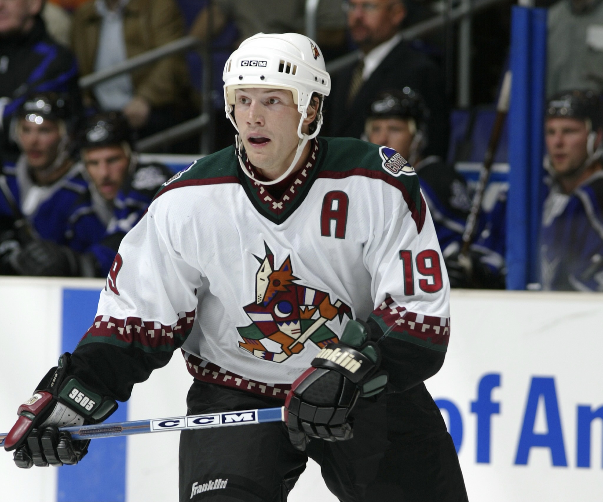
Forward Shane Doan wore the A above the Kachina logo as an alternate captain at the start of the 2002-03 season. (All photos courtesy of Arizona Coyotes).
The Kachina took on several nicknames in its early years. Some called it the Cubist Coyote, a reference to the 20th century art movement that attempts to depict a subject from multiple viewpoints all at once. Some called it the Peyote Coyote, suggesting that it had been created under the influence of the hallucinogen. Some thought it was too busy; some thought it was a hot mess.
“Some of those Original Six teams only have two colors but once you start expanding the league to 18, 22, 26, 32 teams, you’re going to get some different logos,” said Bobby Smith, who was the Coyotes’ GM that first season. “I always liked it and I thought it was an interesting logo, but I certainly had nothing to do with the development of the logo because I’m color blind. Even if I wanted to be, I would not have been involved, but it was not high on my list of priorities. I was more interested in who would be pulling the jersey over their heads than what was on the front of it.”
Fisher got plenty of direction from the league when creating the logo, but there were few constraints placed upon him, save one.
“As we were moving into this the league gave their opinion on the color palette they thought might work for a new NHL team and they were adamant about the logo,” Fisher said in a previous interview. “There were so many angry animals coming on board at that time that they were like, ‘Do not do an angry animal logo because we’ll never say yes.’”
Fisher created several logos that are radically different from the one chosen, including one he calls a flaming paw motif. The one that was chosen, however, incorporated several southwestern themes.
“We decided to see if we could build this legacy of Coyotes in the desert and the American Indian tradition,” said Fisher, who remembers seeking approval from the Hopi Tribe before debuting the logo. “That’s where the Kachina logo came from.”
No player did a better job of selling all things Coyotes than Jeremy Roenick.
There are numerous subtle details incorporated into the logo; details whose significance may go unnoticed. The purple in the the logo is there for Colangelo, whose Suns wore purple. The entire logo forms an A for Arizona. The crescent moon creates a C for Coyotes.
Most of the players warmed quickly to the logo, and longtime Coyotes equipment manager Stan Wilson said the array of colors created options when choosing combinations of pants, gloves and socks, but the jersey that the logo rested upon was a major problem.
“It was a really heavy jersey and the neck was made of a kind of a nylon so it would rub the guys’ necks raw,” Wilson said. “It was always a shock when guys threw their jerseys after games because when you caught them they felt like they weighed 10 pounds.”
Doan remembers a particularly poor performance when the team was still playing at America West Arena under coach Bobby Francis.
“Bobby isn’t the biggest man in the whole world,” Doan said, chuckling. “After the game, we all take our jerseys off and throw them into the bin in the middle of the room so you’ve got like 20-plus jerseys in there, all of them soaking wet. All of a sudden you’ve got 200 or more pounds in that little bin.
“Bobby comes into the room and he just loses his mind on us. He walks over to grab this thing and flip it and he can’t flip it. He keeps trying and he’s getting so mad. We’re all trying not to smile or laugh because it was a bad loss.”
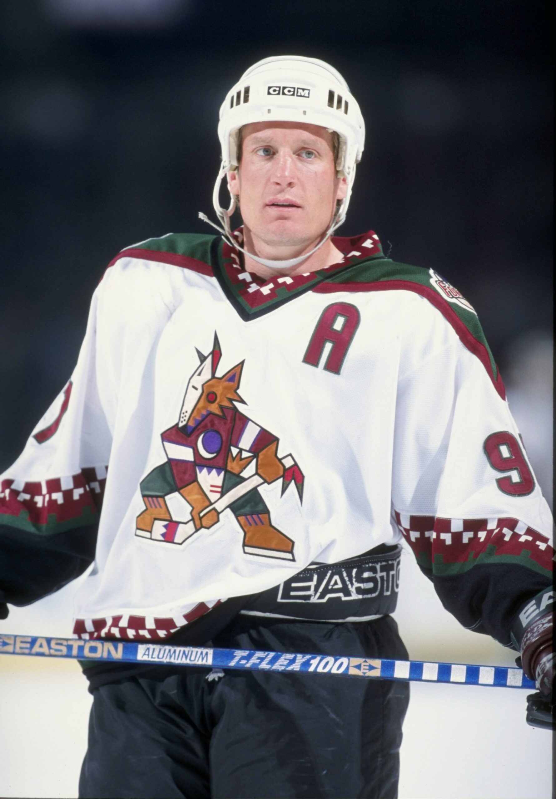
Keith Tkachuk was the first Coyote to wear the captain’s C above the Kachina.
The weight of the jerseys wasn’t the only problem. As Wilson noted, the neck was rough and poorly designed.
“It stood up higher, almost like a polo shirt,” he said.
It was never worse than in a fight, Doan said.
“If you got grabbed it was like having sandpaper dragged along your neck,” Doan said. “All of my collared shirts and lots of other guys; all of them had blood all over their shirts. It was like a rug burn where you’d get these scabs and then four days later they’d be all thick and crusty and you’d go to put on your shirt and it would crack open and you’d bleed.”
Fortunately for the 2021-22 Coyotes, jersey materials have evolved since then. The Kachina has not, but 25 years after its introduction, the perception of that once-controversial logo has taken a 180-degree turn.
“It’s one of the best looking jerseys out there,” said the Coyotes’ first captain, Keith Tkachuk. “I always loved it. It was different, you know, and that’s what it was all about because we were playing in a different market so they needed something unique and they did a great job with the design.
“I don’t know how many colors it has in it but when I look at it, I think of the desert; I think of Arizona. I think it’s awesome.”